
Roboto Serif is a variable typeface family that has been designed to create a comfortable and frictionless reading experience. It is useful in a wide range of media due to the extensive set of weights and widths across a broad range of optical sizes. While it was carefully crafted to work well in digital media, across the full scope of sizes and resolutions we have today, it is just as comfortable to read and work in print media.
Roboto Serif Font Combinations
The aim of the Roboto Serif is to bring better legibility and optimize the reading experience. Legibility is the ability of a reader to distinguish individual characters and words. Because of the good readability of Roboto Serif especially with small size letters we will make font combinations where it will be the main body text.
How can we find a good font match for Roboto Serif?
Finding a suitable font match is not always an easy task. We need to consider contrast, x-height, letter forms, Apertures .. Best place to start is combining serif with sans-serif. We will be looking into some sans-serif typefaces for the Headings and Titles.
We will be analyzing:
x-height: The distance between the baseline and the mean line of lowercase letters in a typeface is called the x-height.
Apertures: An aperture is an opening in a letter form or a symbol.
Axis: The axis is an imaginary line drawn from top to bottom of a glyph that bisects the upper and lower strokes.
Letter forms comparison.
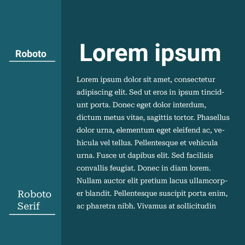
Roboto Serif and Roboto Pairing
Roboto is designed with a dual nature in mind. Its mechanical skeleton and largely geometric forms are paired with friendly and open curves, creating a typeface that is both rigid and natural. Unlike some grotesks that distort letterforms to create a rigid rhythm, Roboto doesn’t compromise, allowing letters to be settled into their natural width. This makes for a more natural reading rhythm, which is commonly found in humanist and serif types.


Here is also Web HTML Live demo.
Roboto Serif and Helvetica Pairing
Helvetica is a sans-serif typeface that was developed in 1957 by Max Miedinger and Eduard Hoffmann. It is a neo-grotesque design, and its use became a hallmark of the International Typographic Style. Helvetica is one of the most popular typefaces in the world. It is known for its clean, no-nonsense shapes that lend an air of lucid efficiency to any typographic message.


Roboto Serif and Arial Pairing
Arial is a contemporary sans serif typeface that has more humanist characteristics than many of its predecessors. The overall treatment of curves is softer and fuller than in most industrial style sans serif faces. Terminal strokes are cut on the diagonal which helps to give the face a less mechanical appearance. Arial is an extremely versatile family of typefaces which can be used with equal success for text setting in reports, presentations, magazines, etc., and for display use in newspapers, advertising, and promotions.


Roboto Serif and Arimo Pairing
Arimo was designed by Steve Matteson as an innovative, refreshing sans serif design that is metrically compatible with Arial. Arimo offers improved on-screen readability characteristics, the pan-European WGL character set, and solves the needs of developers looking for width-compatible fonts to address document portability across platforms.


Roboto Serif and IBM Plex Sans Pairing
IBM Plex is a typeface family designed by Mike Abbink, IBM BX&D, in collaboration with Bold Monday, an independent Dutch type foundry. Plex was designed to capture IBM’s spirit and history, and to illustrate the unique relationship between mankind and machine—a principal theme for IBM since the turn of the century. The result is a neutral, yet friendly Grotesque style typeface that includes a Sans, Sans Condensed, Mono, Serif, and several other styles for several languages, and has excellent legibility in print, web and mobile interfaces. Plex’s three designs work well independently, and even better together. Use the Sans as a contemporary compadre, the Serif for editorial storytelling, or the Mono to show code snippets. The unexpectedly expressive nature of the italics give you even more options for your designs.


Roboto Serif and Work Sans Pairing
Work Sans is a typeface family that is based on early Grotesques, such as those created by Stephenson Blake, Miller & Richard, and Bauerschen Giesserei. The Regular weight and fonts in the middle of the family are designed for on-screen text at medium-sizes (14px-48px) and can also be used in print design. The fonts closer to the extreme weights are designed for display use on the web and in print. Overall, features are simplified and optimized for screen resolutions; for example, diacritic marks are larger than they would be in print.


